
Creating an effective website design can be a challenge. There are so many factors to consider, from the colours you use to the layout of your pages.
But don’t worry; We’re here to help! In this article, we’ll show you how to choose the right colour scheme for your web page. We’ll also cover some other aspects of web design, like layout and typography.
Colours:
Why Are Colours Important in Website Design?
Colours are one of the first things that people notice when they visit a website. They can have a big impact on how visitors perceive your site.
For example, if you’re selling products or services on your eCommerce website, you’ll want to use colours that create a feeling of trust and professionalism. On the other hand, if you’re creating a web page for a fun and quirky brand, you’ll want to use brighter colours that reflect this personality.
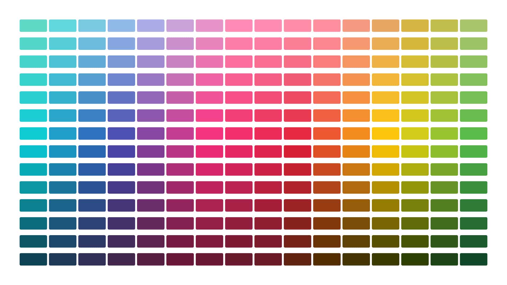
The bottom line is that colours play a significant role in website design. And choosing the right colours for your website is not always easy. There are millions of different colour combinations to choose from, so where do you even begin?
How to Choose a Colour Scheme for Your Website Design?
There are a few things to consider when choosing a colour scheme for your website. First, you’ll want to think about the overall tone of your website. Are you going for a clean and minimal look? Or are you going for something more colourful and vibrant? Once you’ve decided on the overall tone, you can start thinking about specific colours.
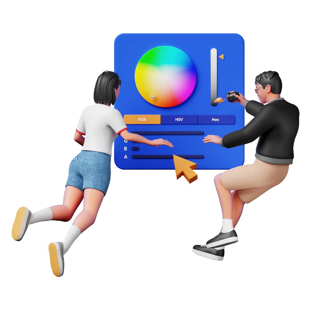
Some website designers like to use what’s called a “colour wheel.” This is a tool that helps you see which colours work well together. You can find colour wheels online or in design books.
Another option is to use a website like Adobe Color CC, which lets you create custom colour schemes.
Once you’ve chosen a few colours that you like, it’s time to start experimenting. Try out different combinations of colours and see how they look on your website. You can also use a website like ColorZilla to get the exact HEX codes for your favourite colours.
1. Get to know colour psychology basics
As a website designer, it’s important to understand how colours affect people’s emotions. This is called “colour psychology.” And it can be helpful in choosing the right colours for your website.
For example, red is often used to create a feeling of urgency or excitement. Blue is often used to create a feeling of calmness and serenity. Yellow is often used to create a feeling of happiness and optimism. And green is often used to create a feeling of nature and relaxation.
Of course, these are just generalizations. Colour psychology is a complex topic, and there are no hard-and-fast rules. But understanding the basics can help you make better choices when choosing colours for your website design.

2. Acquaint yourself with colour theory
In addition to colour psychology, you should also familiarize yourself with “colour theory.” This is a branch of design that deals with the science of colours and how they interact with each other.
There are three primary colours (red, yellow, and blue), and three secondary colours (orange, green, and purple). All other colours are created by mixing these six colours together.
Colour theory can help you choose the right combination of colours for your website design. For example, if you want to create a feeling of harmony, you might try using a combination of two primary colours or two secondary colours.
If you want to create a feeling of contrast, you might try using a combination of a primary colour and a secondary colour.

3. Think about mixing colour combinations
When choosing colours for your website, you don’t have to limit yourself to a single hue. You can also experiment with different “colour combinations.” These are created by mixing two or more different colours together.
For example, a popular colour combination is black and white. This creates a feeling of sophistication and elegance. Another popular combination is blue and green. This creates a feeling of nature and relaxation.
4. Keep it simple
When it comes to website design, less is often more. This is especially true when it comes to colour schemes. A website with too many colours can be overwhelming and cluttered. A website with too few colours can be boring and drab.
The best website designs usually have a simple colour scheme with two or three main colours. This allows the design to be clean and organized, while still being eye-catching and interesting to your website visitors.
So, if you’re feeling stuck, try simplifying your colour scheme. Sometimes, less is more.
5. Contrast your colours
Another important thing to keep in mind when choosing colours for your website is “contrast.” Contrast is the difference between two colours. It’s what makes some colours pop and others recede into the background.
For example, a website with a black background and white text has high contrast. This is easy to read and looks great on all devices. A website with a light blue background and dark blue text has low contrast. This can be difficult to read, especially on mobile devices.
When it comes to website design, higher contrast usually looks better. That’s because it’s easier on the eyes and more readable. So, if you’re having trouble choosing colours for your website, try increasing the contrast.
6. Integrate your branding
If you have an existing brand, you’ll want to make sure that your website design is “on brand.” This means that it should reflect the colours, fonts, and overall style of your company.
For example, if your company’s logo is red and black, you might want to use these colours in your website design. Or, if your company’s branding is playful and youthful, you might want to use brighter colours and more modern fonts.
The bottom line is that your website should be an extension of your brand. It should reflect your company’s values and personality. So, when choosing colours for your website, make sure to keep your brand in mind.


Choose a Primary Colour
One of the first things you’ll need to do when choosing a colour scheme for your website is to choose a “primary” colour. This is the main colour that will be used throughout your website. It should be used for things like your website’s background, headers, and navigation bar.
Your primary colour should be one of your business brand colours. If you don’t have a company brand, you can choose any colour you like. Just make sure it compliments the other colours in your scheme.
Once you’ve chosen a primary colour, you can start building your website’s colour scheme around it. Here are some examples:
Red: Coca-Cola or Nintendo – Implies excitement or happiness
![]()
![]()
Orange: Nickelodeon or Harley-Davidson – Implies energy or adventure
![]()
![]()
Green: Spotify – Implies nature or growth
Blue: Ford or Twitter – Implies trust or authority
![]()
![]()
If you have a coloured logo, match the website’s primary colour to your logo. This will help create a cohesive and unified design.
Choose Your Additional Colours
After you’ve chosen a primary colour, it’s time to choose your website’s “additional” colours. These are the colours that will be used for things like your website’s text, links, and call-to-action buttons.
When choosing additional colours, you’ll want to make sure that they complement your primary colour.
Here are some examples of colour combinations that work well together:
Primary Colour: Red Additional Colours: Yellow, Orange, Pink
Primary Colour: Blue Additional Colours: Green, Purple
Primary Colour: Green Additional Colours: Blue, Yellow
You can use a tool like Adobe Color to help you find complementary colours.
Choose A Background Colour
The background colour is one of the most important colours in your website’s colour scheme. That’s because it sets the tone for your entire website.
A light background will make your website feel airy and spacious. A dark background will make it feel moody and intimate.
When choosing a background colour, you’ll want to consider the overall tone and feeling you want your website design to have. You’ll also want to make sure that it compliments your website’s other colours.
If you’re not sure what background colour to choose, try using white or neutral grey. These colours are versatile and can be used with almost any other colour scheme.
Choose a typeface colour
Another important element of web design is typography. This is the art and science of choosing the right fonts for your website design.
The colours you use for your website’s text can have a big impact on its overall look and feel.
“If you do it Right, It will last forever.” Massimo Vignelli
When choosing colours for your website’s typeface, you’ll want to make sure that they are easy to read. You’ll also want to make sure that there is enough contrast between the colours so that your website is easy to read.
Tips For Choosing Website Colours
When it comes to website design, there are no hard and fast rules. Just because a certain colour combo works for one website doesn’t mean it will work for yours. The most important thing is to experiment and find what works best for you.
Here are a few tips to help you choose the right colours for your website:
• Use a limited colour palette for your brand. Too many colours can be overwhelming and make your website look busy. Stick to 2-3 main colours and 1-2 accent colours for your brand.
• Use light colours for your website’s background and dark colours for your website’s text. This will create high contrast and make your website visually appealing to your website visitors.
• Use complementary colours. Choosing colours that sit opposite of each other on the colour wheel will create contrast and make your website more visually interesting.
• Use a tool like Adobe Color to help you find complementary colours.
• Experiment with different colour combinations until you find something that you like. There is no right or wrong when it comes to website design. The most important thing is that you are happy with the end result.
Useful resources to help you find and choose colours
How to Choose a Color for Your Website: Summary:
– Web design is all about choosing the right colours.
– Start by picking a primary colour, then choose additional colours that complement it.
– Consider the overall tone and feel you want your website to have when choosing colours.
– Use a tool like Adobe Color to help you find complementary colours.
– Experiment with different colour combinations until you find something that you like.
Do You Need Help Creating Your Web Design Colours?
If you need help creating a colour scheme for your website, contact us today. Our team of web design experts would be happy to help you create a website that looks great and reflects your brand’s personality.
How many colours should a website have?
There is no hard and fast rule when it comes to website design. However, it is generally recommended that you use a limited colour palette. Stick to 2-3 main colours and 1-2 accent colours.
Where should I use eye-catching colours?
There is no one answer to this question. It depends on your website design and what you are trying to achieve. However, some common places to use eye-catching colours are in your website's call-to-action buttons and links.
What are the most common colours?
The most common website colours are black, white, grey, and blue. However, it is important to experiment with different colour combinations to find what works best for you.
How to choose a right font for your website
The right font can make or break your website design. It is important to choose a font that is easy to read and has enough contrast with the background colour. You’ll also want to make sure that the font you choose compliments your website’s other colours.
What Are The Different Types of Fonts?
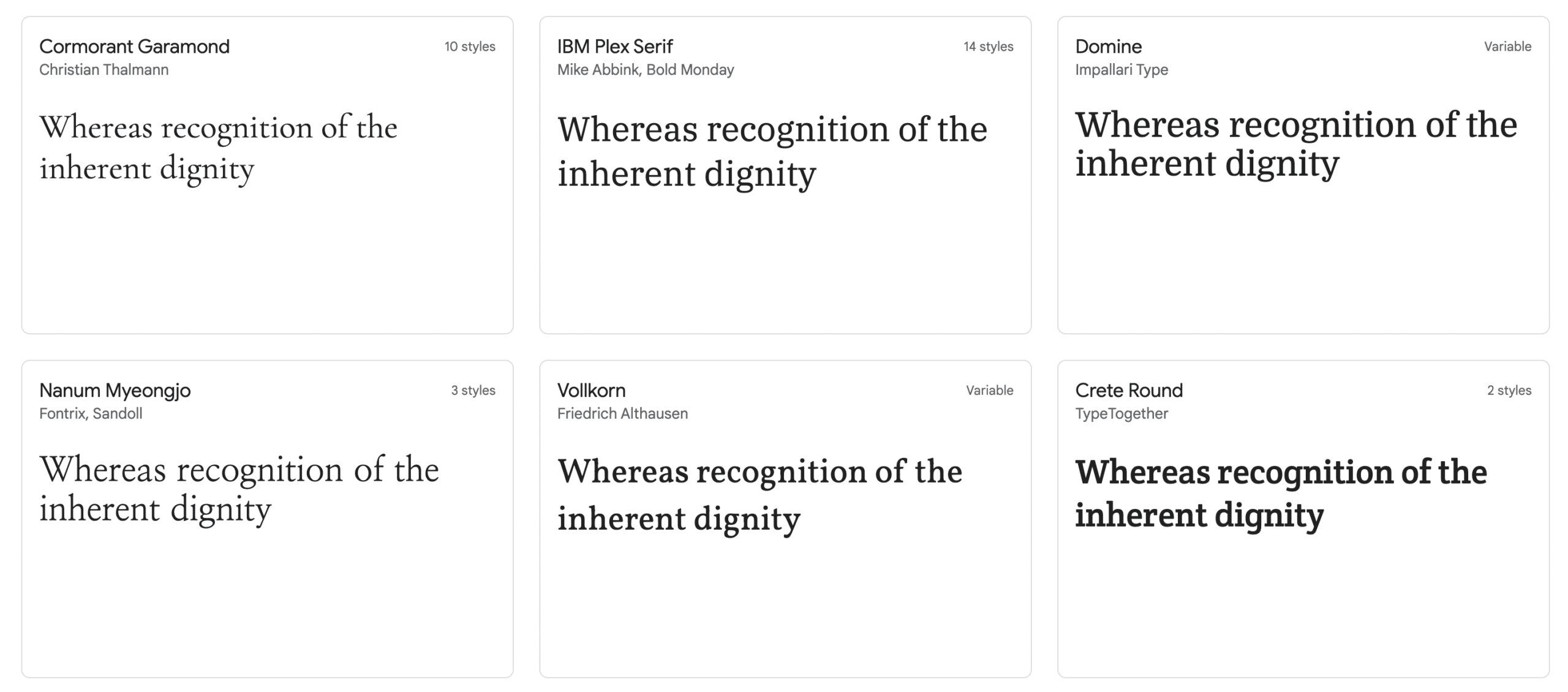
There are four main types of fonts: Sans-Serif, Serif, Script, and Display.
Sans-serif fonts are the most common type of fonts. They are easy to read and have a clean, modern look. Some popular sans-serif fonts include Arial, Helvetica, and Verdana.
Serif fonts are similar to sans-serif fonts, but they have small lines (or serifs) at the end of each letter. Serif fonts are less common than sans-serif fonts but they can add a touch of elegance to your website design. Some popular serif fonts include Times New Roman, Georgia, and Cambria.
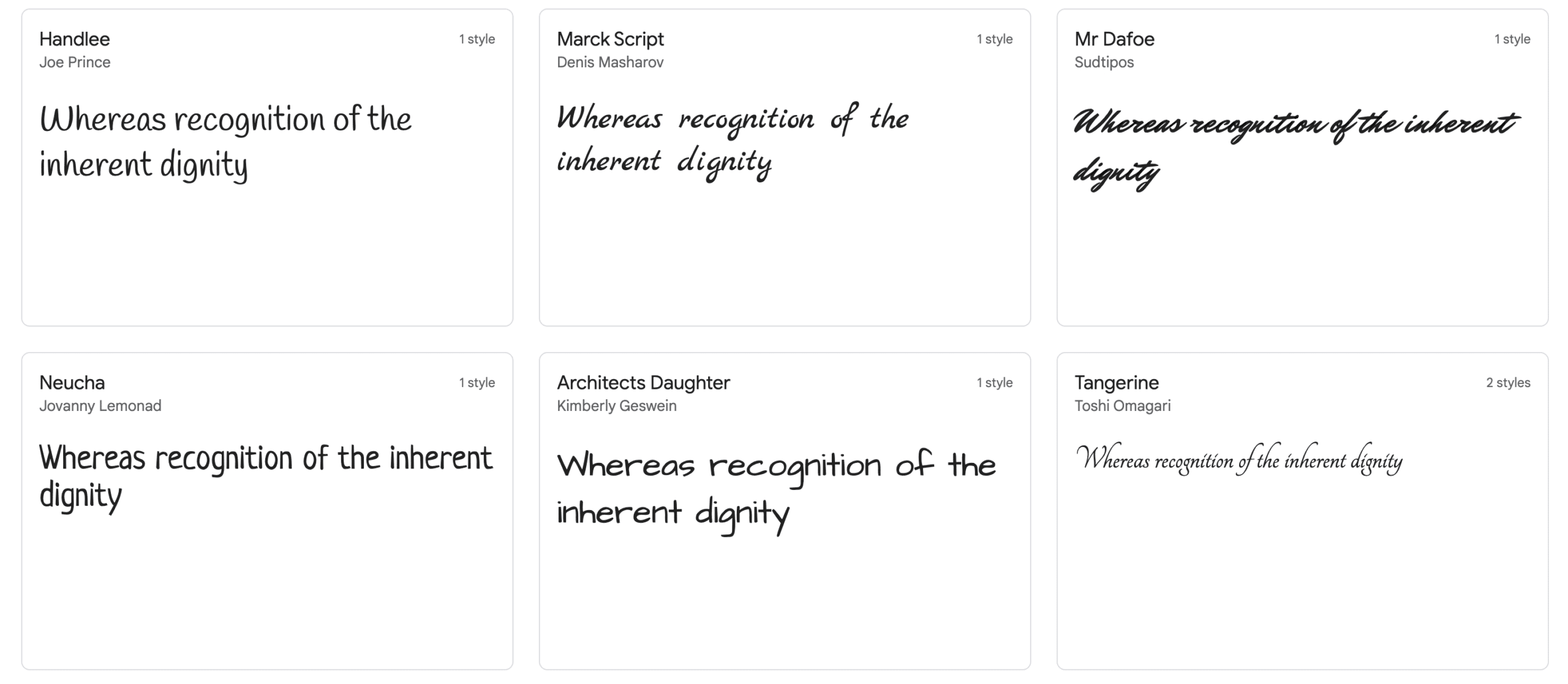
Script fonts are ornate and decorative. They are not as easy to read as sans-serif or serif fonts but they can add a unique and stylish look to your website design. Some popular script fonts include Zapfino, Edwardian Script, and Brush Script.
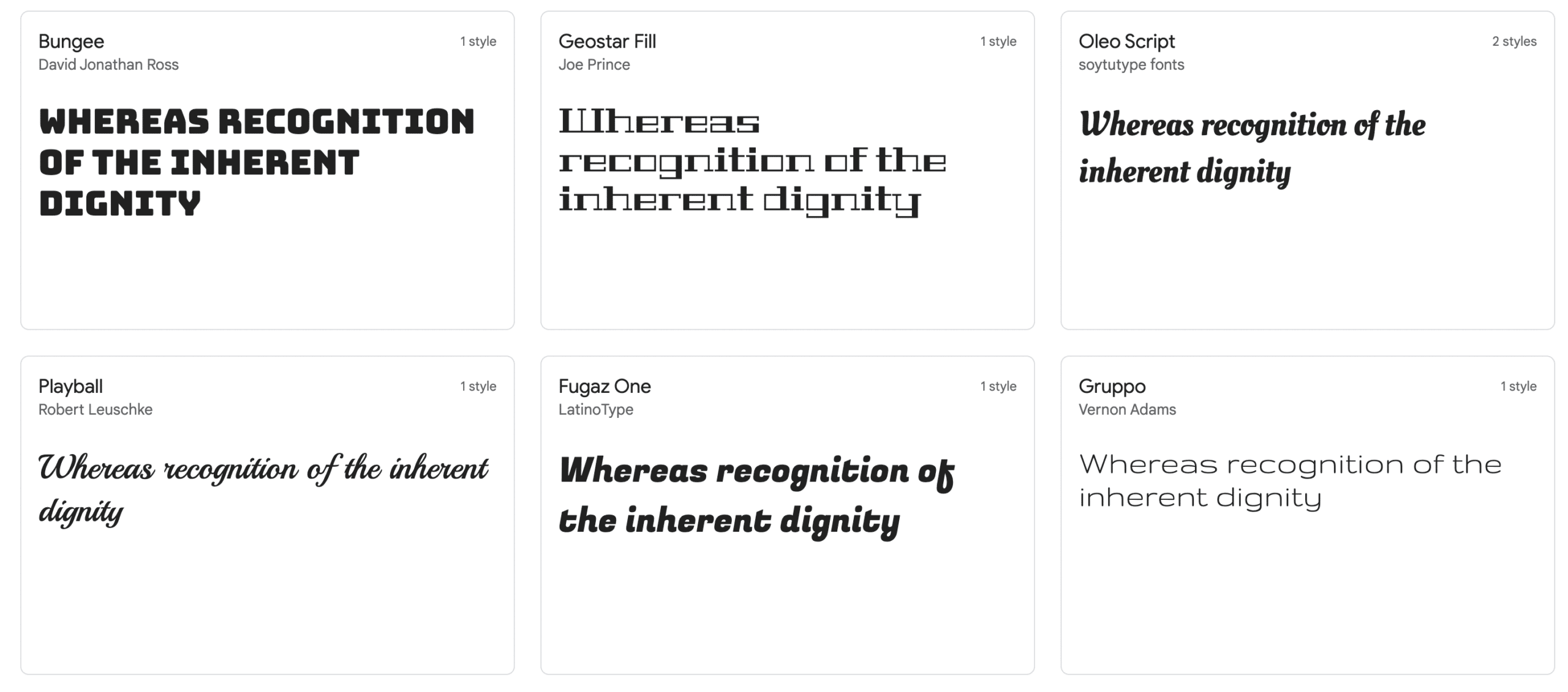
Display Fonts are the most ornate and decorative. They are generally not used for website design because they can be difficult to read. Display fonts are best used in small doses, such as in headings or titles. Some popular display fonts include Bodoni, Didot, and Trajan.
1. Start from the basics
When it comes to fonts, the first step is to choose a primary font. This will be the main font that you use on your website. Once you’ve chosen a primary font, you can then select one or two secondary fonts. These will be used for headlines and other places where you want to add some visual interest.
2. Your typographic should mirror your website design.
The font you choose should match the overall design of your website. If your website is modern and sleek, then you’ll want to choose a font that reflects that. On the other hand, if your website has a more vintage or rustic feel, then you’ll want to choose a font that compliments that style.
3.Choose the number of typefaces and rank them by importance.
When it comes to website design, less is usually more. You’ll want to limit the number of fonts you use to 2. Anything more than that, and your website will start to look cluttered and busy.
Primary Font: This is the main font that you will use on your website. It should be easy to read and have good contrast with the background colour. You have to use the primary font as your headings and larger text on your web design.
Secondary Font: This is a secondary font that you can use for your body and other places where you want to add some visual interest.
Tertiary (accent) font: This is an additional font that you can use for small details and accents. It should be used sparingly, as too much of it can make your web design look cluttered.
4. Test your fonts before you commit to them.
The best way to test a font is actually to use it in your web design. Create a mock-up of your website and experiment with different fonts until you find one that you like. You can also use online tools like Google Fonts and Adobe Typekit to preview different fonts.
5. Use different font weights to create a hierarchy.
You can use different font weights (bold, italic, etc.) to create a hierarchy in your web design. This will help users understand which elements are the most important on your website.
6. Be mindful of the load times
While fancy fonts may look great, they can actually add to the load time of your website. This is because each font needs to be downloaded separately. So if you’re using multiple fonts, it’s best to use ones that are relatively light and easy to load.
7. Think about the font combinations
When it comes to web design, font combinations are just as important as the fonts themselves. You’ll want to make sure that the fonts you choose complement each other. A good rule of thumb is to pair a sans-serif font with a serif font. This contrast will help create visual interest and make your web design more pleasing to look at.
8. Use web-safe fonts whenever possible.
Web-safe fonts are fonts that are pre-installed on most computers and devices. This means that there’s no need to download them separately, which can help reduce your website’s load time.
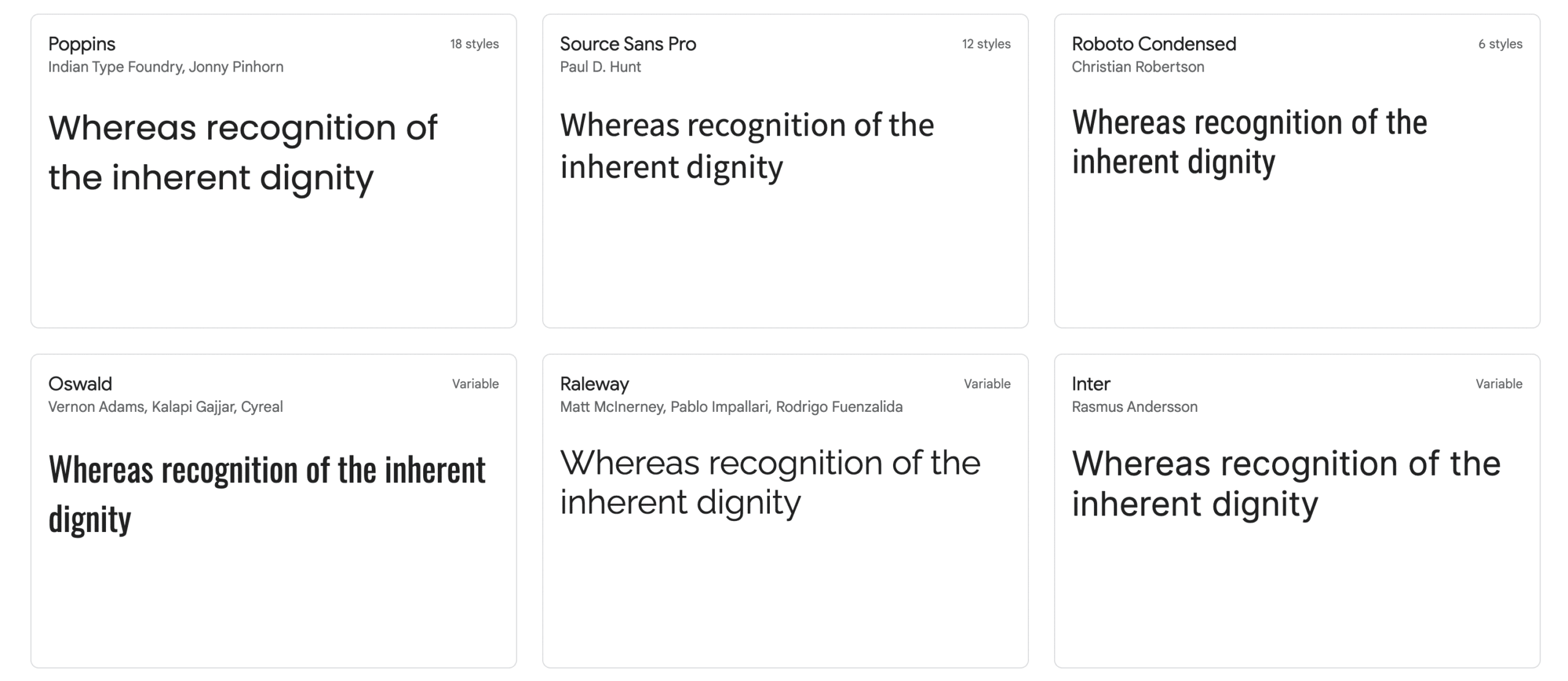
Some popular web-safe fonts include Roboto, Lato, and Poppins.
If you need help with pairing fonts, there are several great online tools that can help you out. Google Fonts has a great tool that allows you to select two fonts and see how they look together.
Adobe Typekit also has a similar tool that can help you find the perfect font combination for your web design. Fontpair is another great website that offers free fonts that go well together.
9. Make sure your fonts are legible.
One of the most important aspects of choosing a font is making sure that it is legible. This means that users should be able to read it easily, even when they’re viewing it on a small screen.
So when you’re testing fonts, make sure to view them on all devices (laptop, tablet, smartphone) to see how they look.
10. Consider readability
When choosing a font, it’s important to consider readability. You want to make sure that the font you choose is easy for people to read. This is especially important if you’re using a script or display font.
If you’re not sure whether a font is readable, try testing it out by reading some text in that font. If it’s difficult to read, then it’s probably not a good choice for your website.
11. Font Inspiration and other useful tools
If you’re feeling stuck and need some inspiration for your web design, there are several great resources that can help you out.
Font Inspiration is a website that offers a curated selection of fonts that can be used in web design.
Another great resource is Canva’s Ultimate Guide to Fonts. This guide covers everything from finding the perfect font for your brand to using fonts in your website.
It also includes a section on font pairings, which can be really helpful if you’re having trouble finding two fonts that go well together.
WhatTheFont is a website that can be really helpful if you come across a font you like but don’t know what it’s called. Just upload an image of the font and it will tell you what it is. This can be really helpful when you’re trying to find the perfect font for your web design.
FontFace Ninja is a browser extension that allows you to identify fonts on websites. This can be really helpful if you’re looking for web design inspiration and want to know what fonts are being used on a particular website.
Layout
How To Choose the Right Layout for Your Web Design?
The layout of your website is just as important as the design. A great website design will have a layout that is easy to navigate and use.
How Many Types of Web Design Layouts Exist?
There are a few different types of website layouts that you can choose from. The most common website layouts are:
– Single page layout: This type of layout is perfect for a small website or landing pages. All of the content is on one page, making it easy for users to find what they’re looking for.
– Multi-page layout: This type of layout is perfect for larger web design with a lot of content. The content is divided into different sections, making it easy for users to find what they’re looking for.
– Grid layout: This type of layout is perfect for portfolios or image-heavy websites. The content is arranged in a grid, making it easy to view and navigate.
– Sidebar layout: This type of layout is perfect for blogs or news sites. The sidebar can be used to display additional content, making it easy for users to find what they’re looking for.
What Is the Difference Between a Web Layout and a Web Design?
A web layout is a way in which the content is arranged on the page. The layout of a web site should be visually appealing, easy to use and navigate.
A web design is the overall look and feel of the site.
The web design includes the web sites colour scheme, templates, typography, call to action, photography, blog, and video.
Here are some tips on how to choose the right layout for your web design.
1. What kind of website are you designing?
The layout of your website should be based on the type of webpage you’re designing. For example, if you’re designing a website for a business, you’ll want to make sure that the layout is clean and professional.
This means that you’ll want to avoid using too many colors or images. If you’re designing a website for a blog, you may want to use a more creative layout that includes images and videos.
2. Who is your target audience?
When choosing a layout for your website, it’s important to consider who your target audience is.
You’ll want to make sure that the layout is easy for them to navigate and use. For example, if you’re designing a website for kids, you’ll want to use bright colors and easy-to-understand navigation.
If you’re designing a website for adults, you can use a more sophisticated layout.
Learn about 5 Tips on How to Create a User Persona
3. What is your website’s purpose?
The layout of your website should be based on the purpose of your website. For example, if you’re designing a website to sell products, you’ll want to make sure that the layout is easy to navigate and use.
If you’re designing a website to provide information, you may want to use a more creative layout that includes images and videos.
4. How much content do you have?
The amount of content you have will also affect the layout of your website. If you have a lot of content, you’ll want to make sure that the layout is easy to navigate and use. If you have a limited amount of content, you may want to use a more creative layout.
5. What kind of design do you want?
The layout of your website should be based on the overall design of your website. For example, if you want a clean and simple design, you’ll want to use a layout that is easy to navigate and use.
If you want a more creative design, you may want to use a more creative layout that includes images and videos.
6. How much time do you have?
The amount of time you have to design your website will also affect the layout of your website. If you have a lot of time, you may want to experiment with different layouts. If you have a limited amount of time, you’ll want to use a layout that is easy to navigate and use.
7. What budget do you have?
The budget you have for your website will also affect the layout of your website. If you have a limited budget, you’ll want to use a layout that is easy to navigate and use. If you have a larger budget, you may want to use a more creative layout that includes images and videos.
8. What skills do you have?
The skills you have will also affect the layout of your website. If you’re not confident in your design skills, you’ll want to use a layout that is easy to navigate and use.
If you’re more confident in your design skills, you may want to use a more creative layout that includes images and videos.
9. What software do you have?
The software you have will also affect the layout of your website. If you’re using a website builder, you’ll want to use a layout that is easy to navigate and use. If you’re using design software, you may want to use a more creative layout that includes images and videos.
10. How much experience do you have?
The amount of experience you have will also affect the layout of your website. If you’re new to website design, you’ll want to use a layout that is easy to navigate and use. If you’re more experienced, you may want to use a more creative layout that includes images and videos.
11. Always use a responsive layout for your website designs
A responsive website design (RWD) is a website design that is easy to navigate and use on any device, including mobile phones and tablets.
RWD is important because it ensures that your website will look good on mobile and desktop or all devices.
The best website designs are responsive website designs.
12. Use a grid-based layout
A grid-based layout is a layout that uses a series of rows and columns to organize content. Grid-based layouts are easy to navigate and use, and they’re also great for responsive website design.
13. Use white space
White space is the area around your content. It’s important to use white space in your website design because it makes your website easier to read and navigate.
14. User Experience (UX)
User experience (UX) is how easy it is for people to use your website. It’s important to consider UX when you’re designing your website because you want people to have a positive experience when they visit your site.
15. Follow Design Trends
Design trends are the styles and designs that are popular at a certain time. It’s important to follow design trends because they can help you create a website that looks modern and up-to-date. However, you don’t want to follow design trends blindly. Make sure you understand why a trend is popular before you use it in your website design.
17. Pick the right colours
Colours are an important part of website design because they set the tone for your website. You’ll want to choose colours that match the overall look and feel of your web design.
For example, if you’re designing a website for a business, you’ll want to use colours that are professional and easy to read. If you’re designing a website for a fun and friendly website, you’ll want to use bright and cheerful colours.
If you are an e-commerce website, you’ll want to use colours that are known to convert website visitors into customers or clients, like orange and green.
Web Design Inspiration Sites
If you’re still having trouble choosing the right colours for your website design, it might help to get some design inspiration from other designers. There are lots of great website designs out there. And many of them have won awards.
One great place to find some of the best website designs and inspiration is the Awwwards website. This web site showcases the best website designs from around the world. You can browse through thousands of different award-winning web sites and see which ones stand out to you.
Another great place to find inspiration is the CSS Design Awards website. This website showcases the best CSS-based website designs. You can browse through different categories like “Best Website Designs” or “Best Use of Colour.” or “Award Winning Website Designs”
Webby Awards: The webby awards is another great website design inspiration site. This web site showcases the best website designs from around the world.
In conclusion:
When you’re designing your website, it’s important to keep in mind some key design principles. These principles will help you create a website that is easy to use, modern, and stylish.
Some of the most important design principles to keep in mind are responsive website design, using a grid-based layout, using white space, and following design trends. Additionally, you’ll want to make sure you pick the right colours for your website design.
Finally, if you need some inspiration, there are lots of great website designs out there to look at.
Why is Pruve Web Agency the best at building your brand online presence?
We specialize in creative Branding & Graphic Design, Website Design, Search Engine Optimization (SEO), Search Engine Marketing, Social Media Marketing, and more.
Pruve Web Agency’s team of experts will help you create a great online presence for your business. We have the experience and knowledge to help you achieve your goals. Contact us today to get started!